
Photography: Yussuf Gamal
Visual Identity
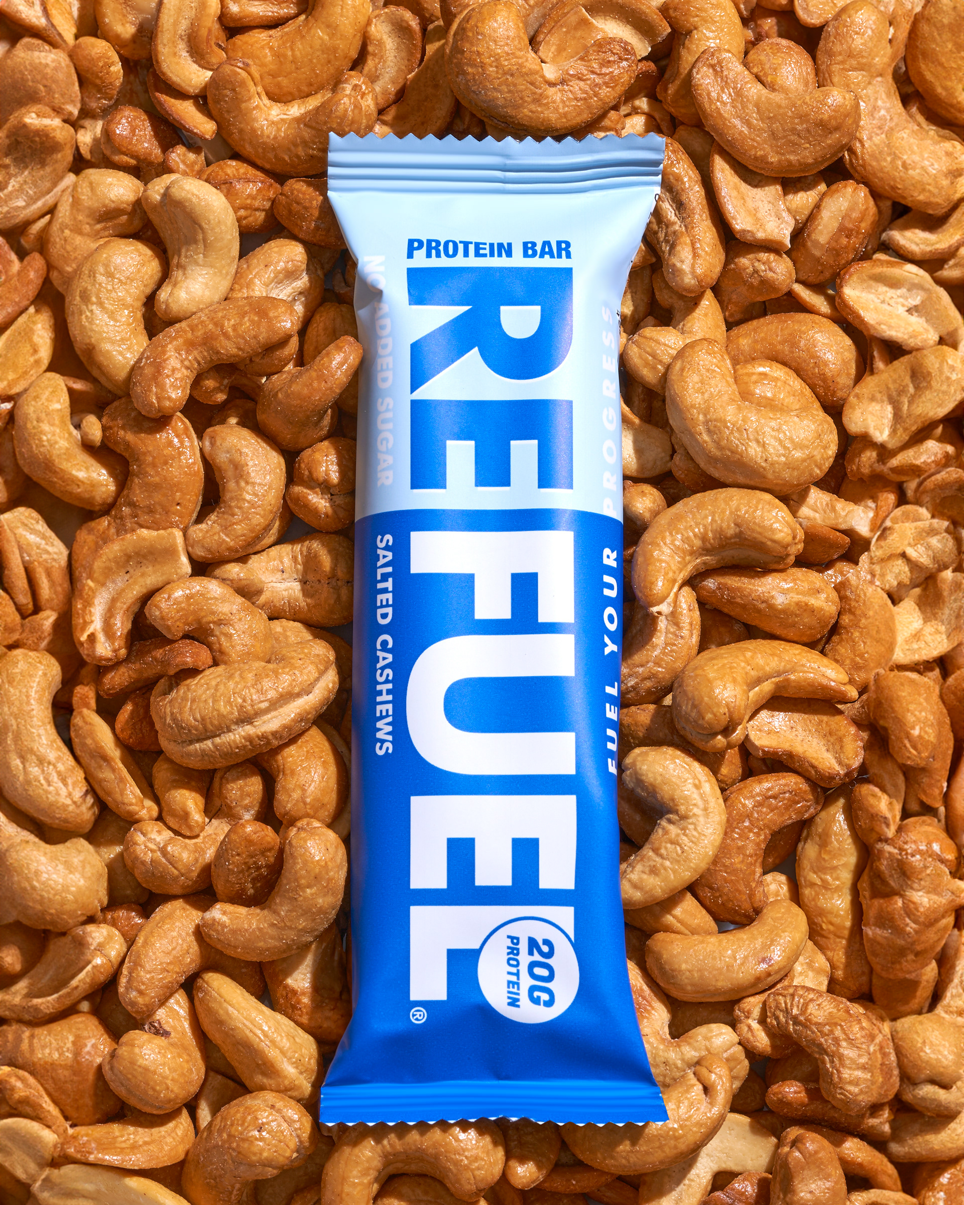
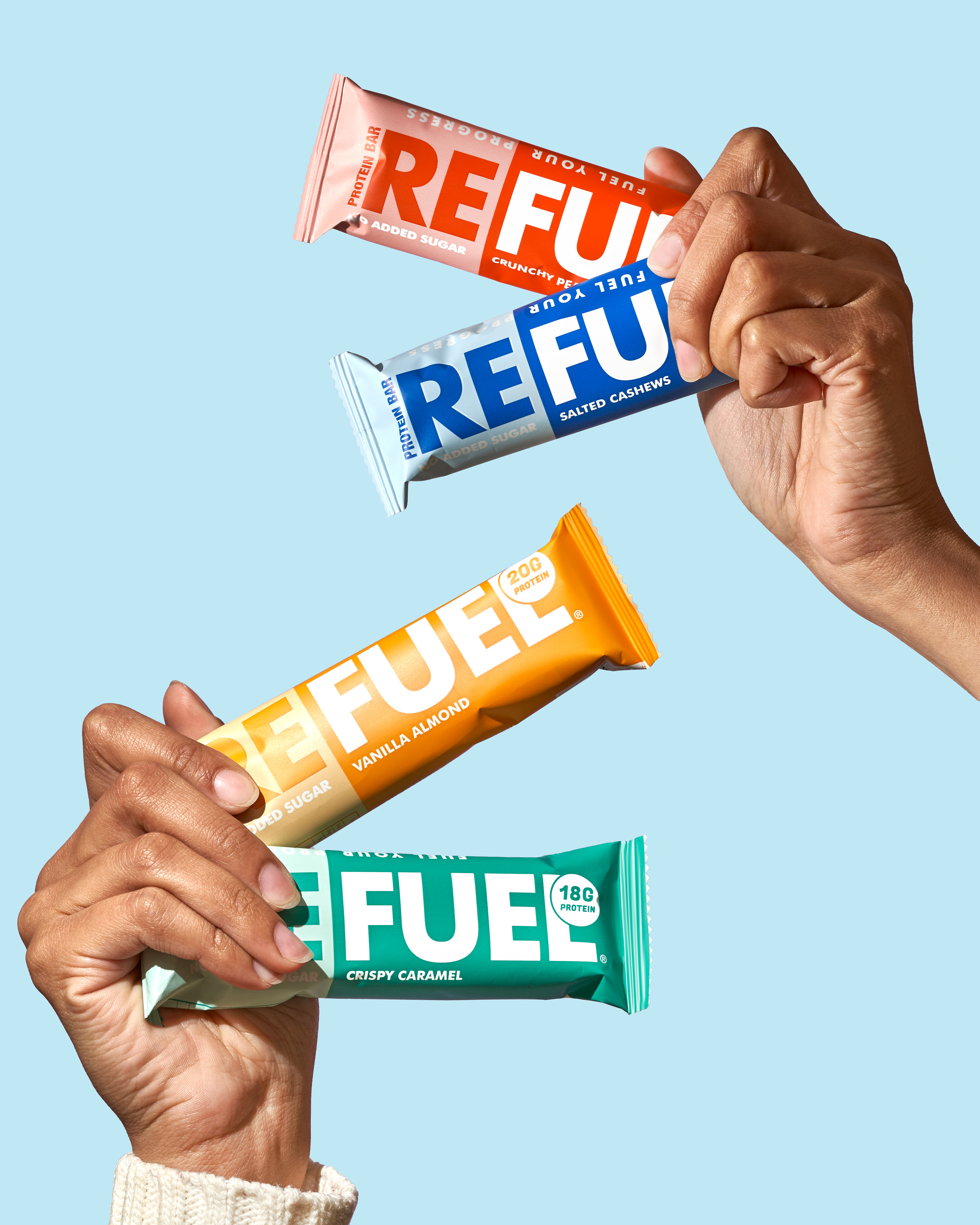
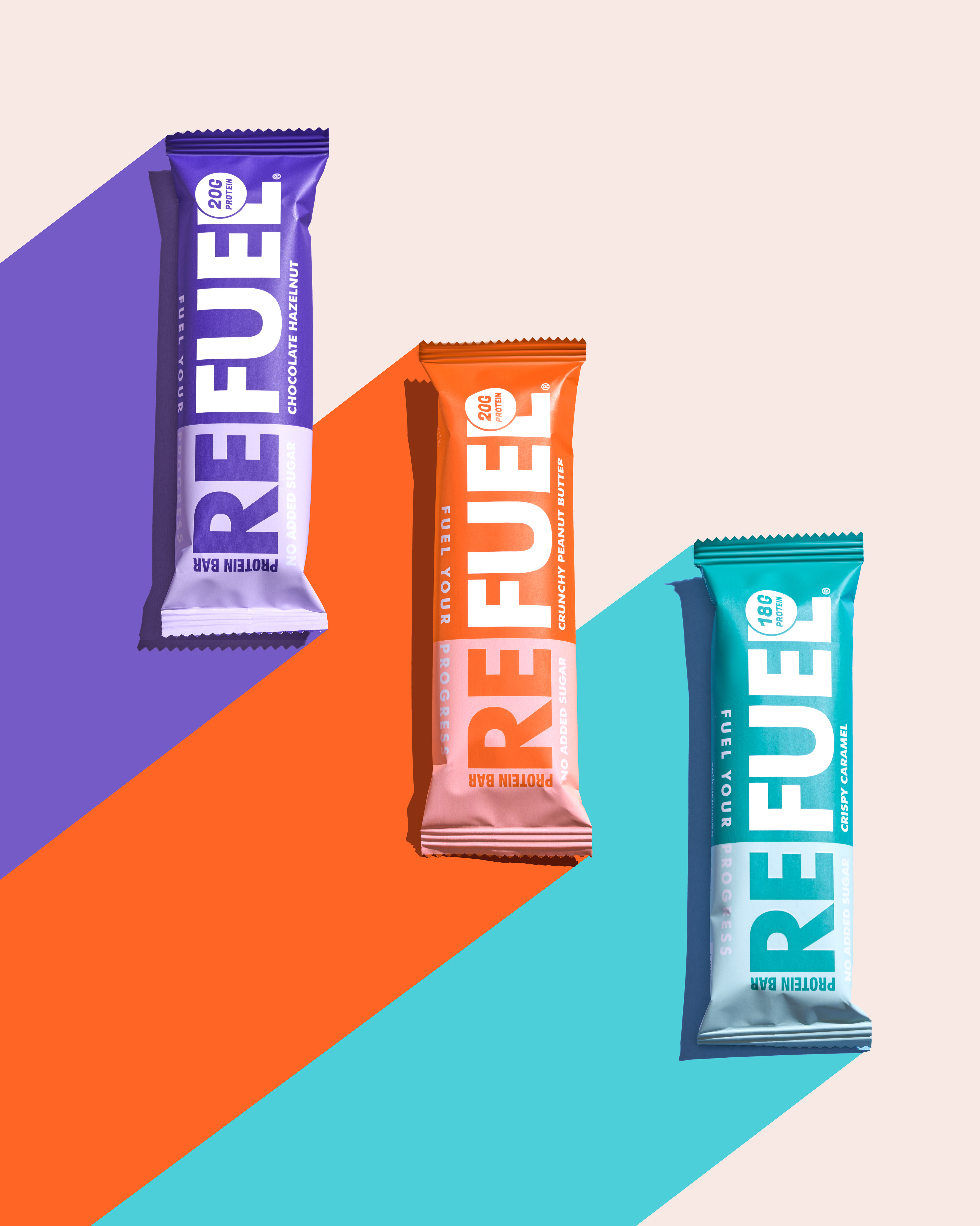
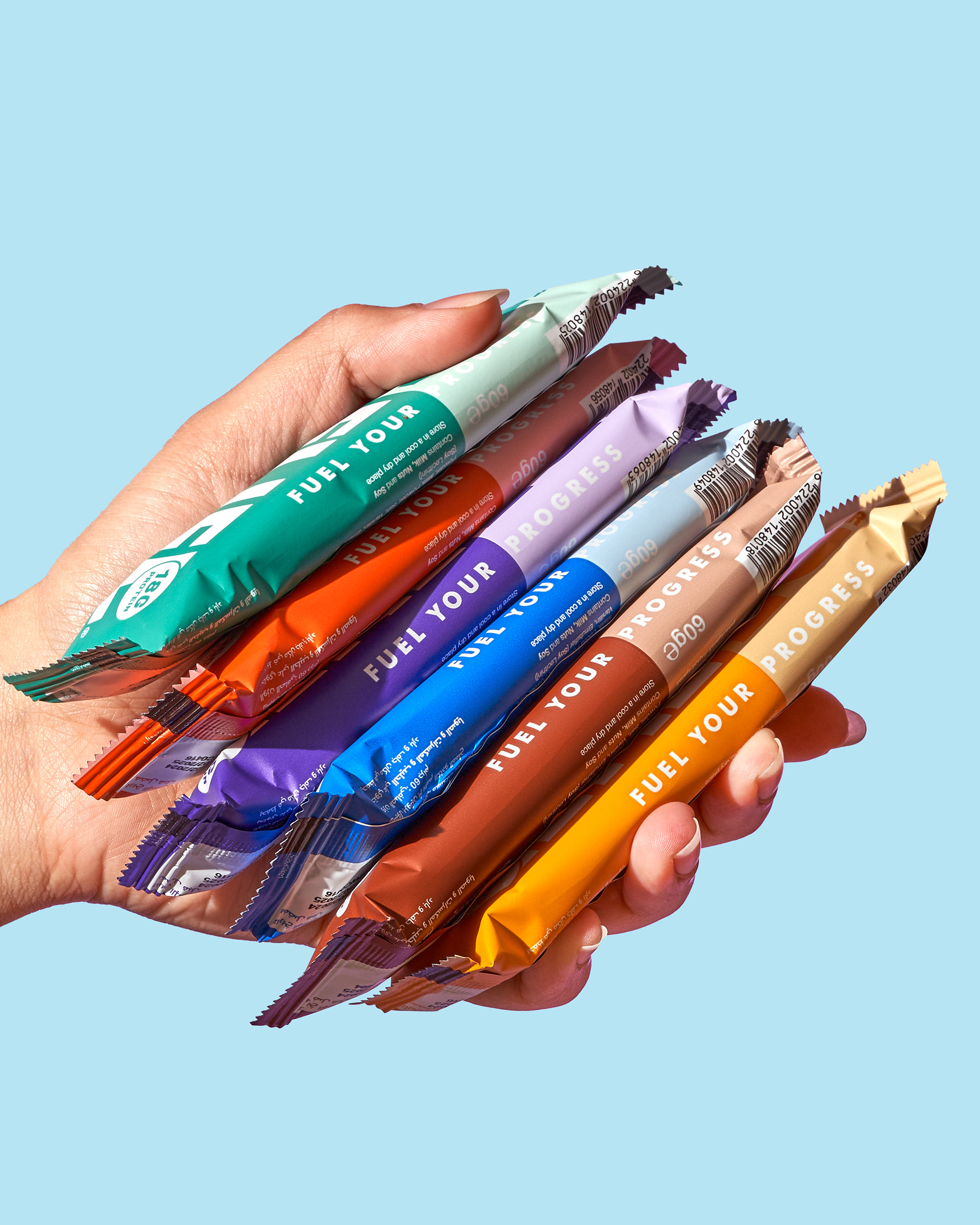
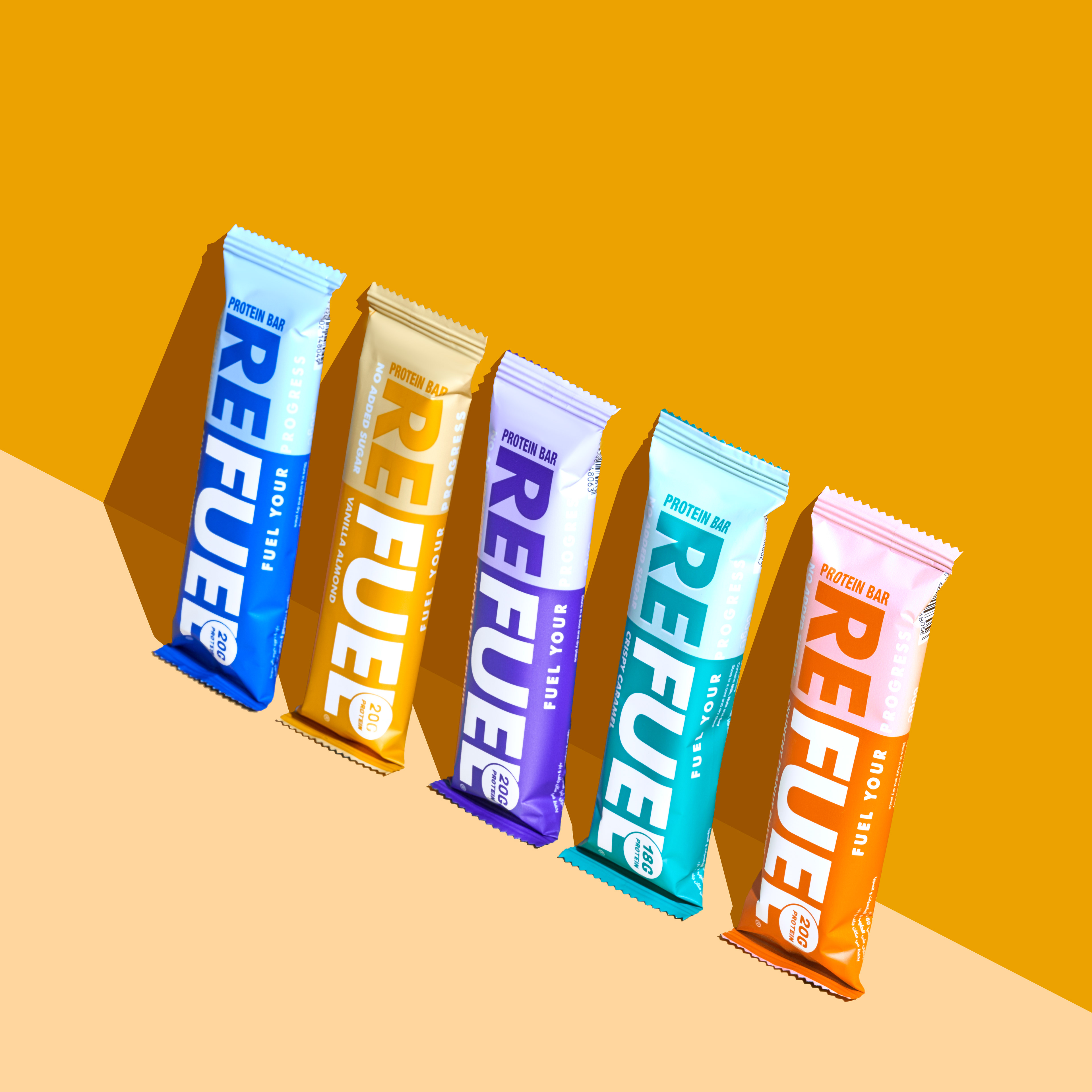
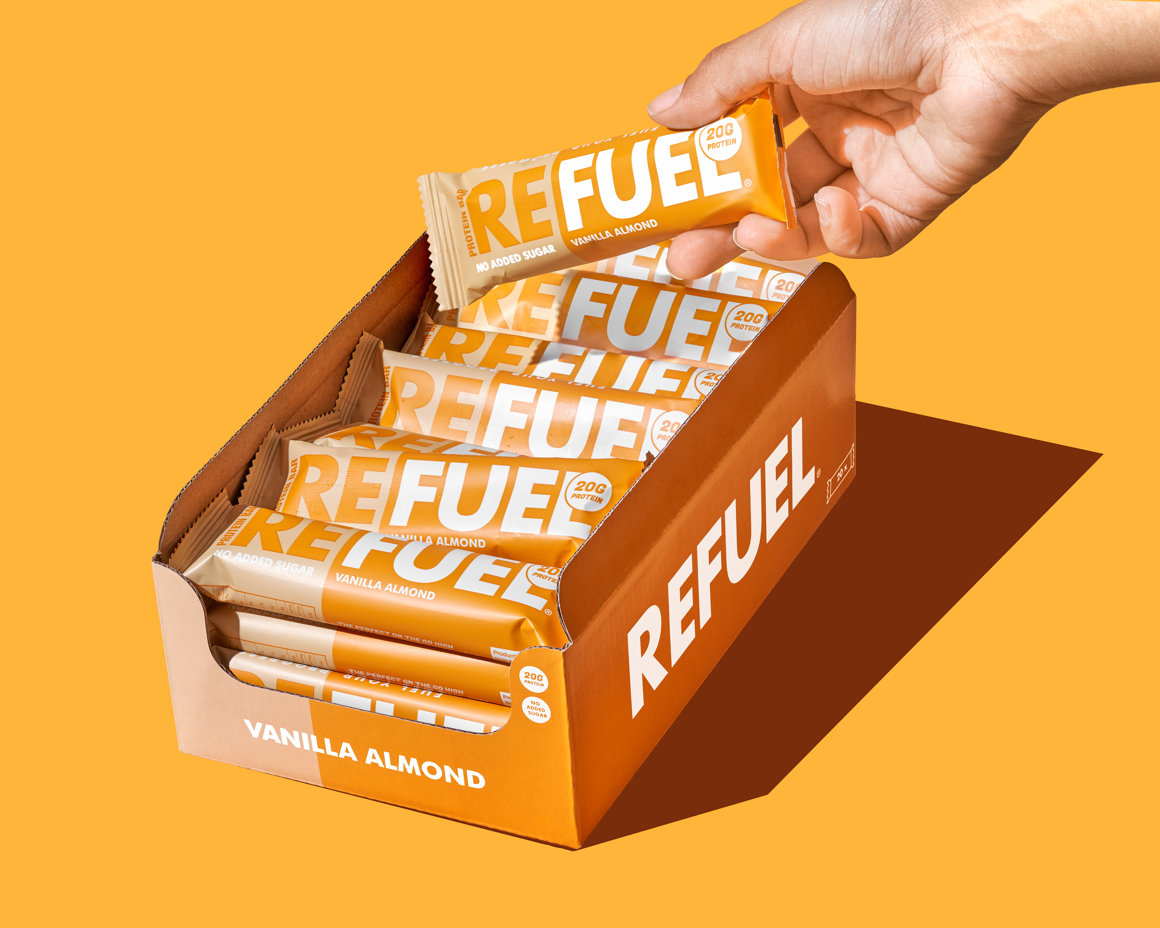
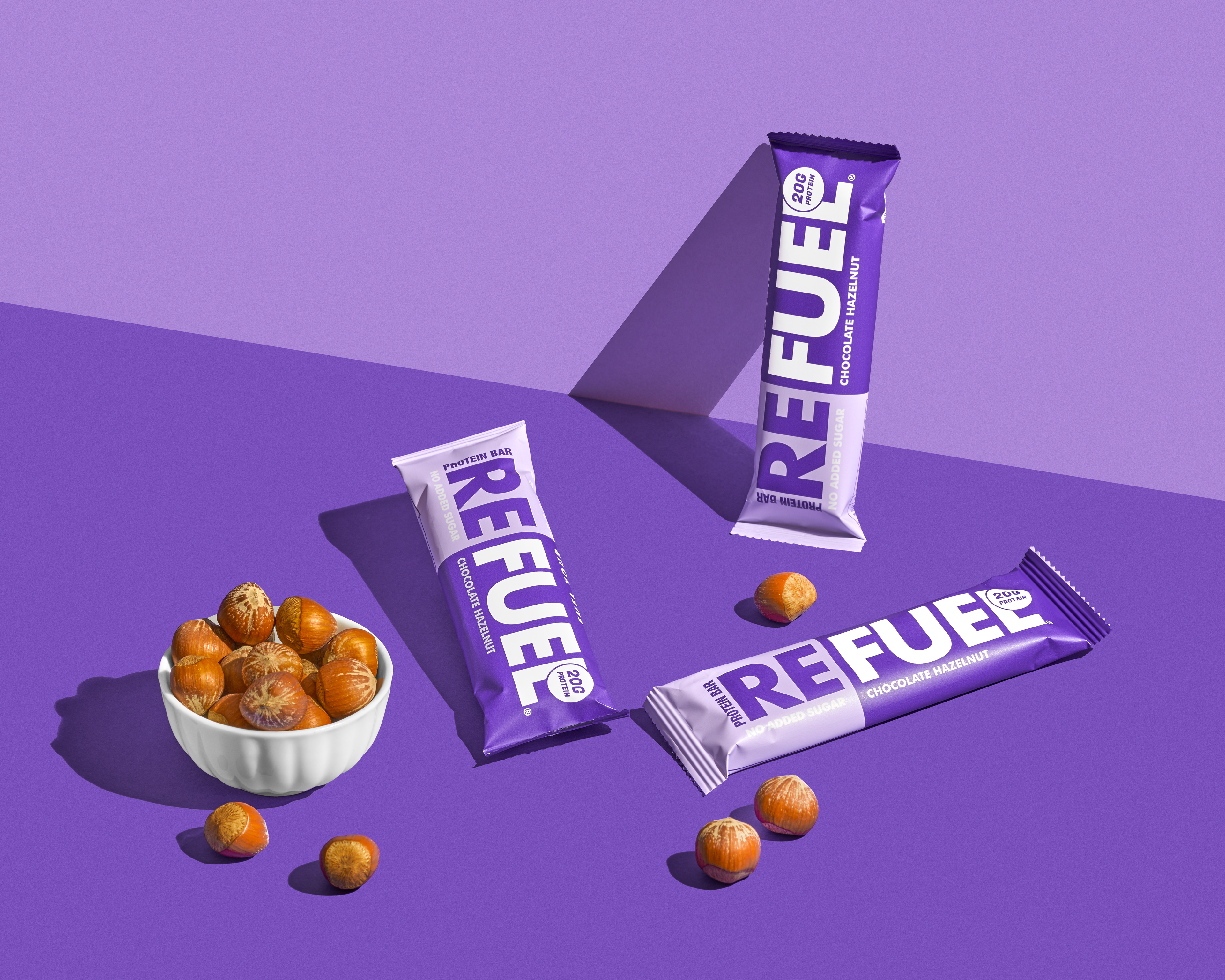
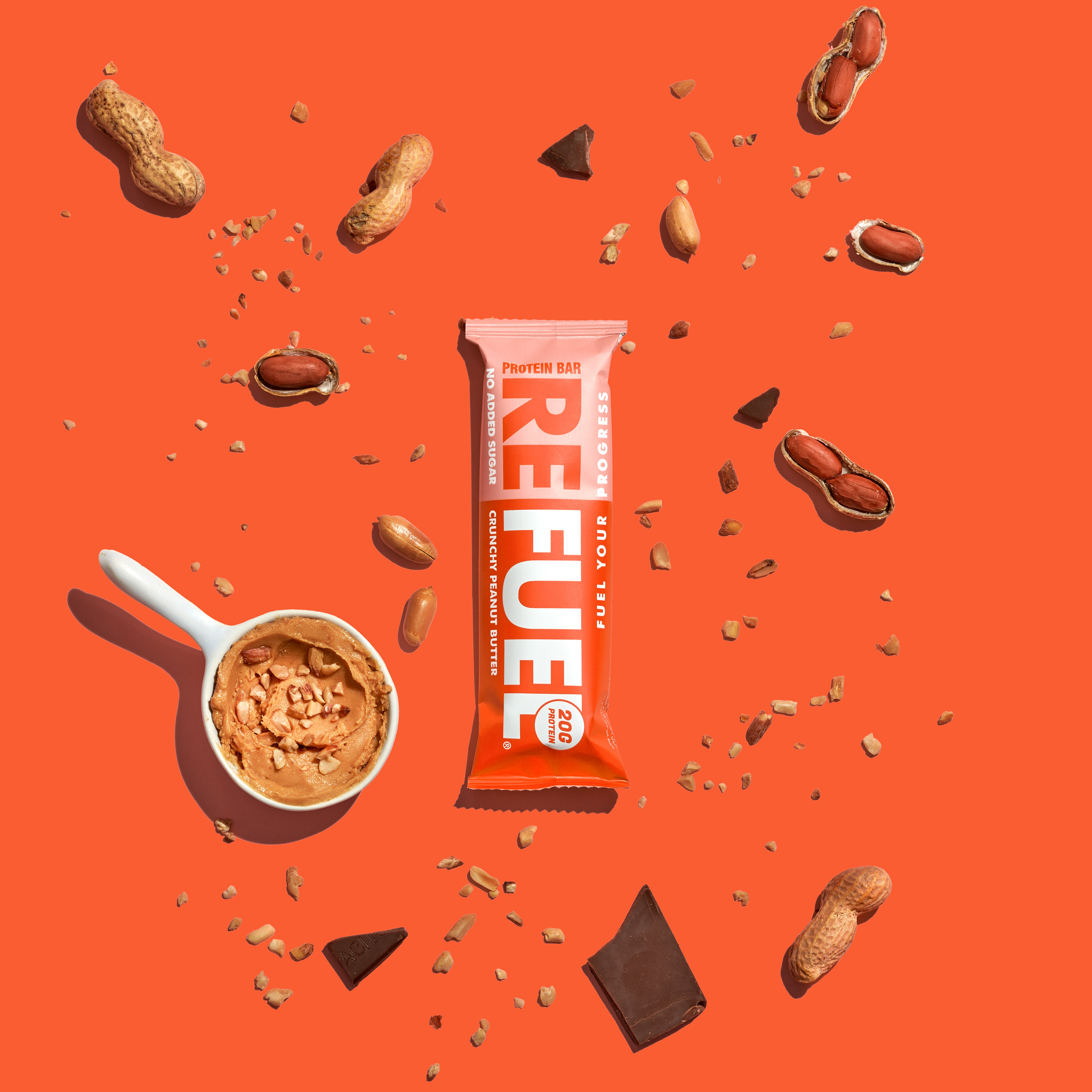
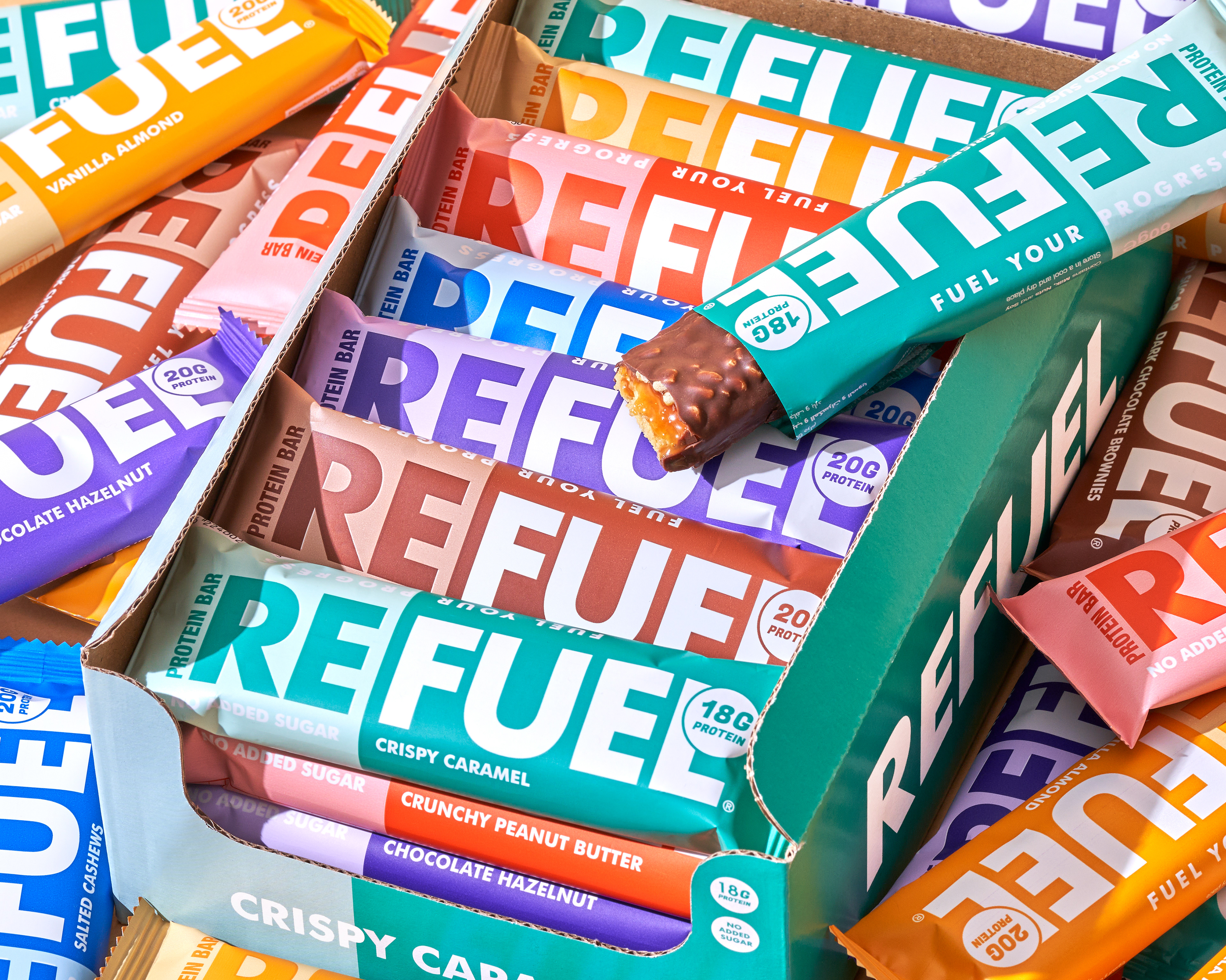
Design Style: Minimal, confident, and straightforward. The large, bold "REFUEL" logotype dominates the pack, instantly communicating purpose and brand recall.
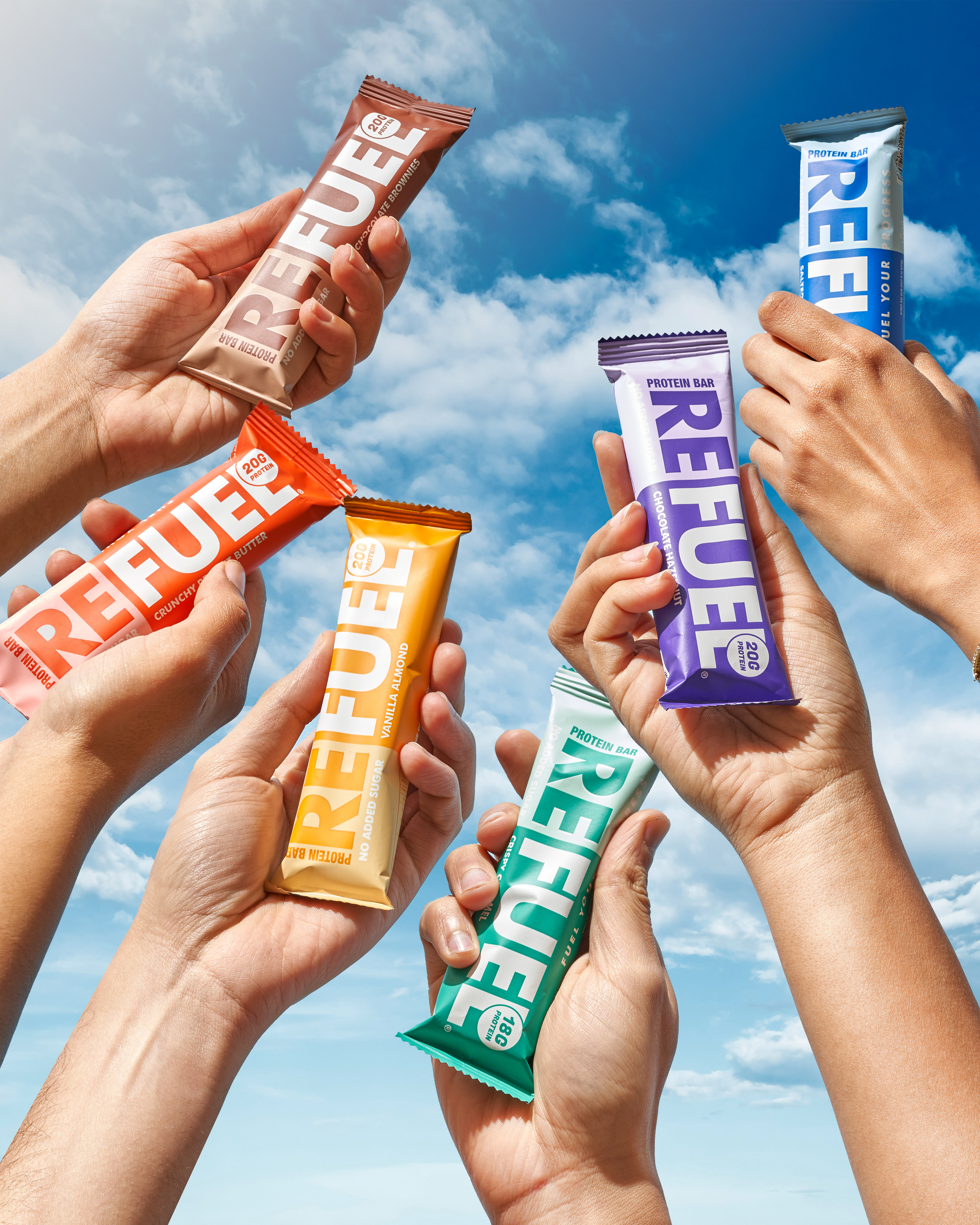
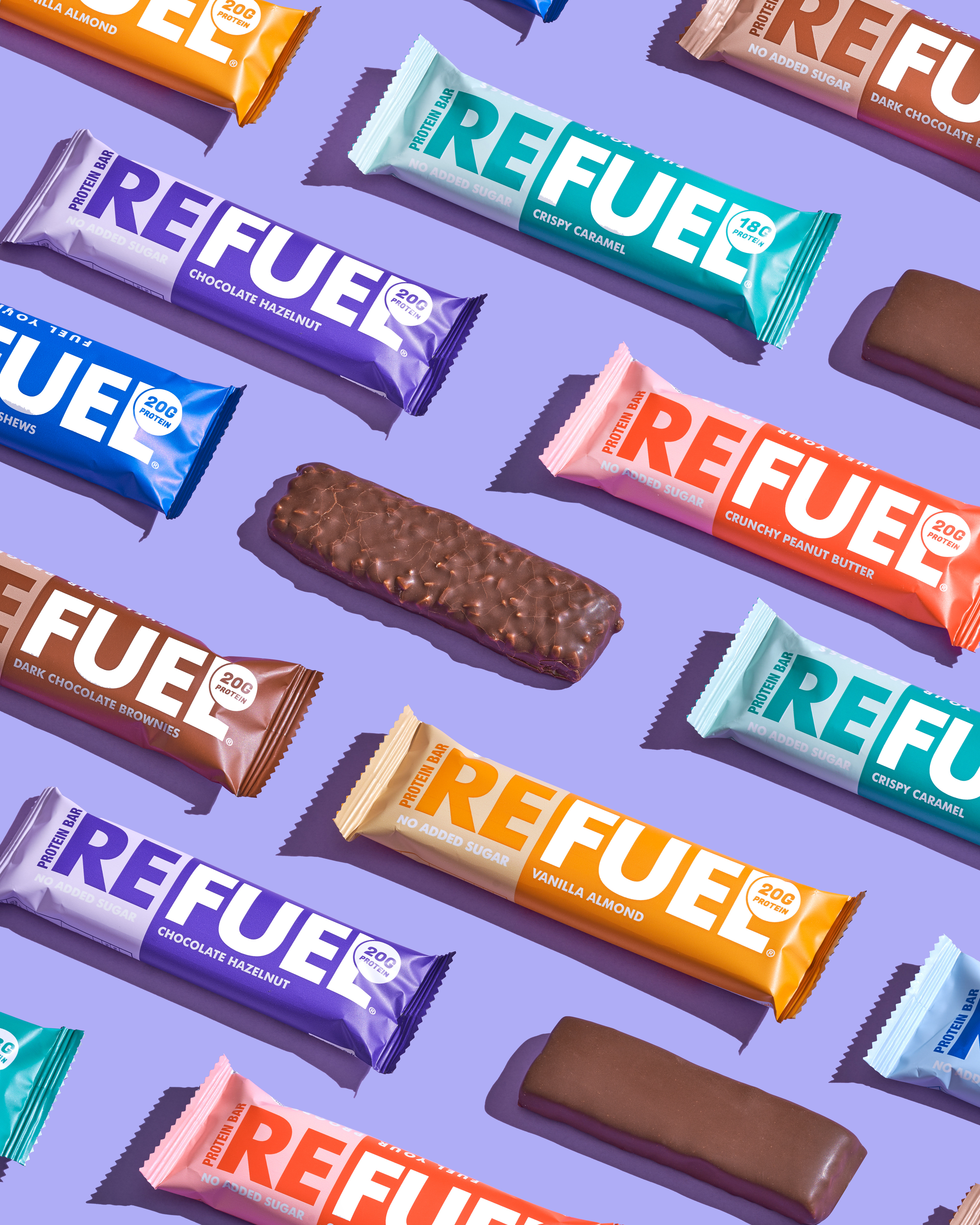
Color Palette: A high-impact spectrum of bright, saturated colors—each flavor owns its own bold hue, making the range instantly recognizable and visually exciting both in-store and online.
Typography: Heavy, sans-serif, all-caps typography for the main logo—paired with smaller, clean geometric fonts for nutritional callouts (protein count, sugar-free claims). This contrast keeps the pack modern and easy to scan.
Layout: Stripped-back composition with color-block backgrounds and minimal text, allowing the product name and benefit claims to shine without visual clutter.
Messaging
Core Tagline: Fuel Your Progress.
Tone of Voice: Energetic, uplifting, and direct. Messaging focuses on action, empowerment, and real performance benefits, cutting through the noise with short, punchy statements.
Brand Positioning
Refuel is the bold, healthy choice for those who demand more from their snacks. With high protein, no added sugar, and clean ingredients, it’s designed to fuel your body without weighing it down. Our vibrant, minimal design reflects our promise—nutrition that’s as pure and energizing as it is eye-catching. REFUEL makes it easy to choose health without sacrificing flavor or style.
Photography & Lifestyle Imagery
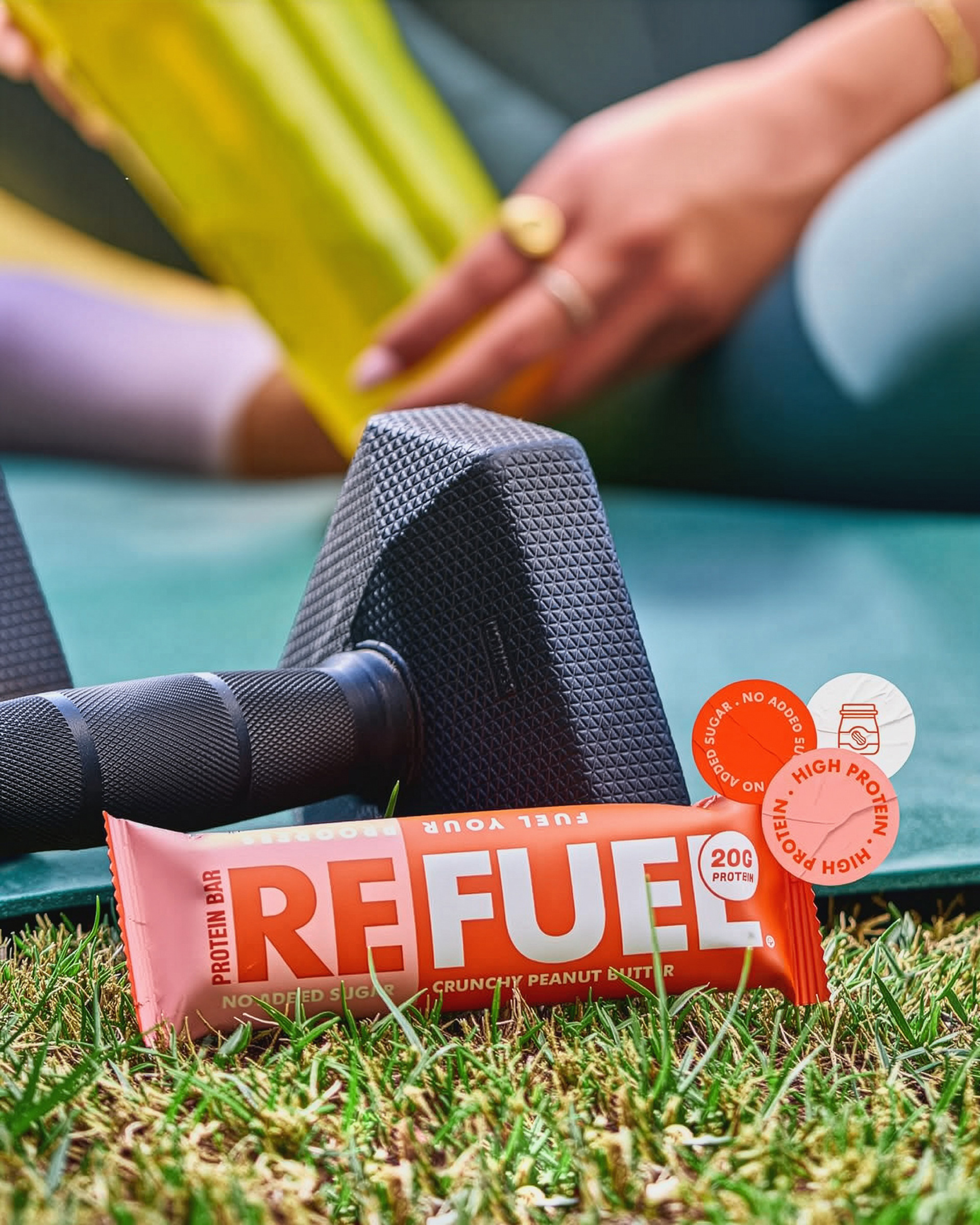
Product Shots: Bright, well-lit, overhead or dynamic angled shots showing the variety of colors and flavors together (like a vibrant mosaic). Lifestyle: Action-driven moments—urban runners, cyclists, and climbers—contrasted with relaxed recharge moments, showing the versatility of Refuel as both an energy boost and a recovery treat. Texture Close-ups: Crisp detail shots of the bar’s layers to highlight indulgence without losing the health focus.
Why It Works
Shelf Impact: Bold colors + oversized logo ensure visibility from a distance.
Flavor Recognition: Individual color-coding creates quick purchase decisions.
Lifestyle Alignment: Appeals equally to fitness enthusiasts, busy professionals, and adventure seekers.
Consistency: Minimalist style ensures a cohesive brand experience across packaging, advertising, and digital channels.